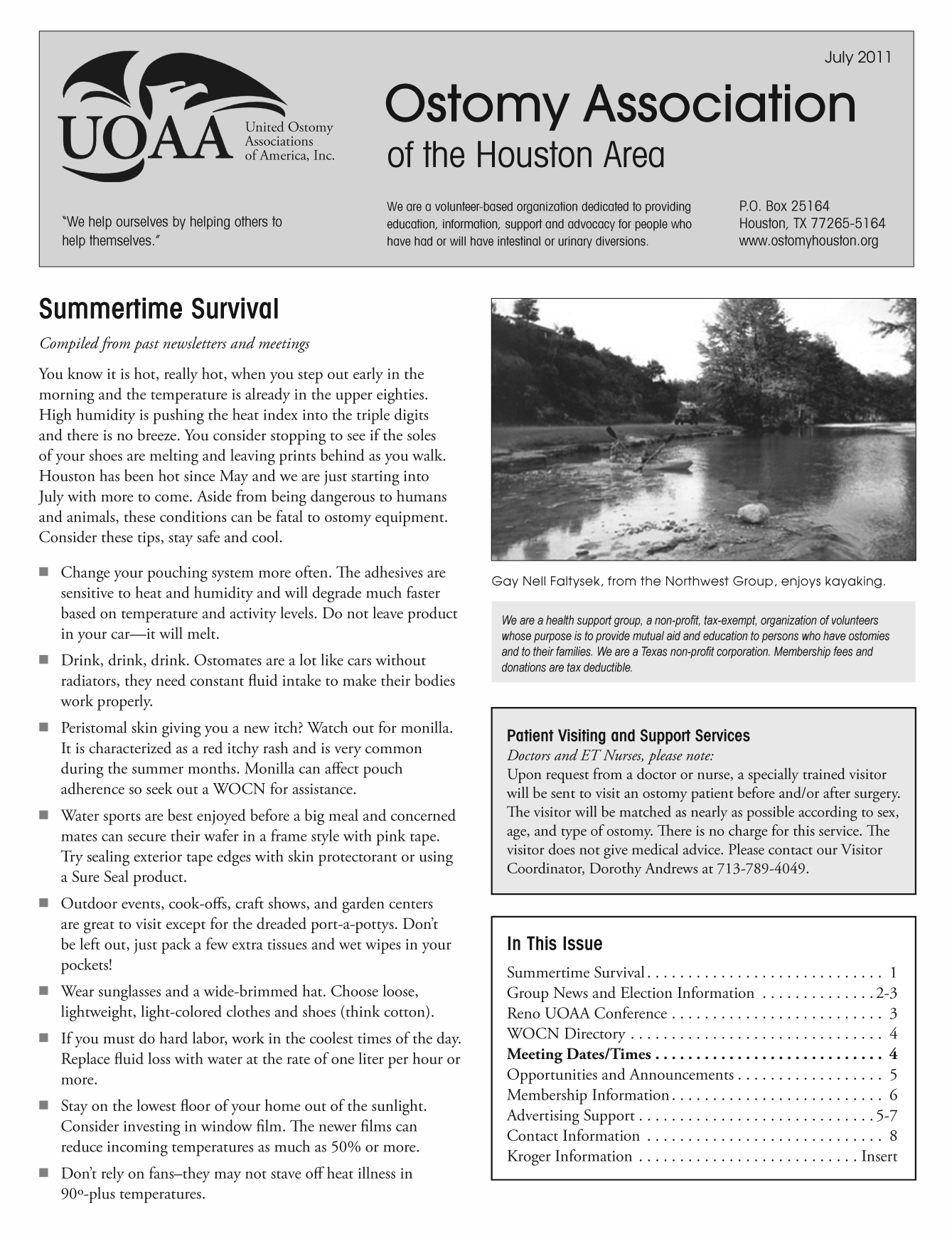
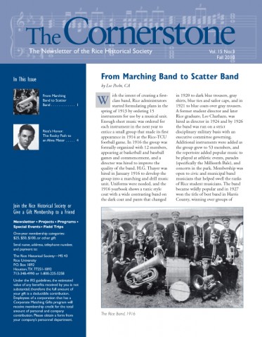
 The paper newsletter remains an effective and popular tool for communicating information. With e-newsletters filling our inboxes, some of us have to do a brutal unsubscribe to reduce the number that reach us. One click makes it easy to subscribe to e-newsletters, but it is much more difficult to find the time to read them all. But we all know that a brief printed newsletter can be read in one “sitting” (and we all know the favorite reading spot in the house!)
The printed newsletter has some advantages over electronic newsletters. Our neighborhood civic club still prints a newsletter six times a year. The homes in our neighborhood were built in the 1960s, and there are still many original owners living here. Many of those folks prefer to receive their neighborhood information in a printed newsletter. But an electronic PDF posted to the club’s website satisfies those who prefer getting their information online. My point is that there are still segments of the population who benefit from receiving printed materials, including newsletters.
Newsletters are often 8-12 pages with brief articles and photos. They are a good vehicle for distributing information to customers, employees, your membership or club. Take a fresh look at your communication efforts and you might find that an old favorite (the printed newsletter) can be a great way to stay in touch.
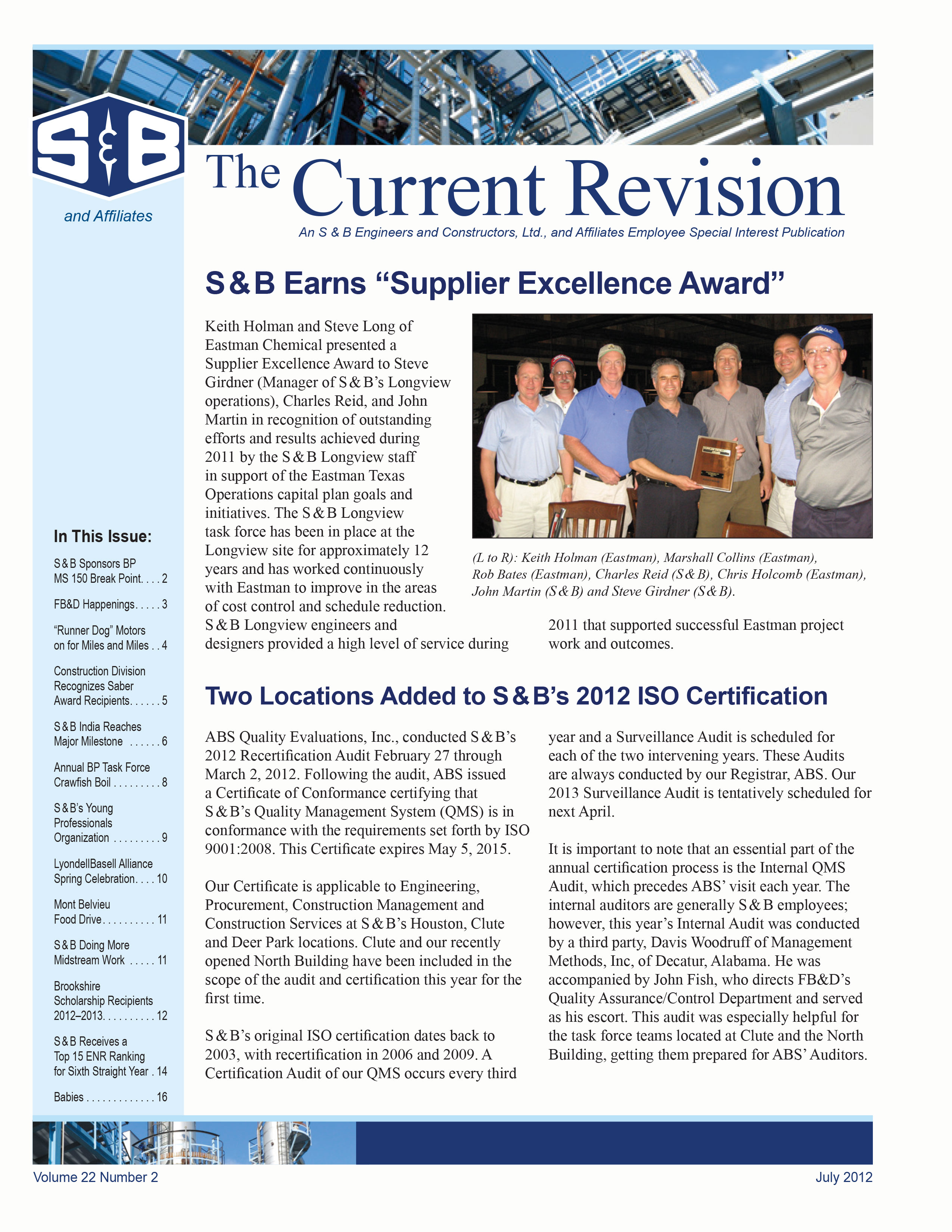

 The paper newsletter remains an effective and popular tool for communicating information. With e-newsletters filling our inboxes, some of us have to do a brutal unsubscribe to reduce the number that reach us. One click makes it easy to subscribe to e-newsletters, but it is much more difficult to find the time to read them all. But we all know that a brief printed newsletter can be read in one “sitting” (and we all know the favorite reading spot in the house!)