University of Maryland’s New Uniforms
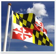
Since I was born in Baltimore I have a strong love for the Maryland flag. As an elementary school student, I wrote a report on the state flag (with an elaborate full-color drawing, of course). The Maryland flag is striking and memorable. The design is derived from the shield in the coat of arms of George Calvert, the first Lord Baltimore. The shield features a yellow-and-black checkerboard pattern and a red-and-white cross representing Calvert’s mother’s family (the Crosslands).
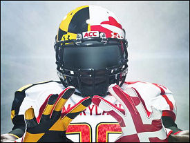
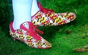 While watching college football a few weekends ago, I was truly shocked to see the flag decorating the uniforms of the University of Maryland Terrapins (or Terps). The yellow and black checkerboard pattern is placed on the right side of the uniform, including the right sleeve, arm warmers, gloves, and the right half of the helmet. The red and white cross design is placed on the left side, in a similar fashion. And the shoes! Oh my goodness, the SHOES! They leave me speechless.
I’m not much of a fashion expert, but these uniforms are visually jarring. Perhaps the goal is to distract the other team! Maryland won their first game of the season—maybe there’s something to this strategy.
Lord Baltimore must surely be rolling over in his grave.


 The paper newsletter remains an effective and popular tool for communicating information. With e-newsletters filling our inboxes, some of us have to do a brutal unsubscribe to reduce the number that reach us. One click makes it easy to subscribe to e-newsletters, but it is much more difficult to find the time to read them all. But we all know that a brief printed newsletter can be read in one “sitting” (and we all know the favorite reading spot in the house!)



 While watching college football a few weekends ago, I was truly shocked to see the flag decorating the uniforms of the University of Maryland Terrapins (or Terps). The yellow and black checkerboard pattern is placed on the right side of the uniform, including the right sleeve, arm warmers, gloves, and the right half of the helmet. The red and white cross design is placed on the left side, in a similar fashion. And the shoes! Oh my goodness, the SHOES! They leave me speechless.