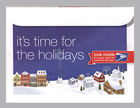
 This holiday mailer from the U.S. Postal Service arrived in my mailbox in December. The illustrations and interior design are holiday-inspired and attractive. The mailer folds out to five panels and contains information on mailing and shipping during the holiday season.
However, before I could get to the good stuff inside, I faced the challenge of opening this letter. Although it looks like this is a traditional envelope, it is not. The decision to create a design that is confusing was a poor choice. The item is glued at the top edge, with stretchy clear glue. But for those of us with less-than-perfect vision, this design serves only to frustrate. Our job, as graphic designers, is to make information easily understood and accessible. So, this item, though attractive, fails its first objective…getting the recipient to open it!



 This holiday mailer from the U.S. Postal Service arrived in my mailbox in December. The illustrations and interior design are holiday-inspired and attractive. The mailer folds out to five panels and contains information on mailing and shipping during the holiday season.