Cutting Edge Design
Caesars Palace® Ad

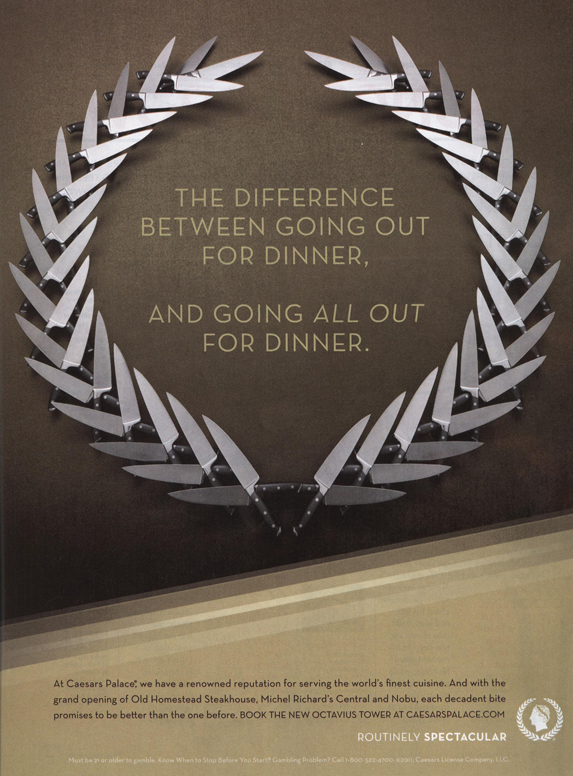
While thumbing though the November issue of Food & Wine, I came across this ad. It caught my eye for several reasons. The magazine is full of attractive photos of fabulous meals and recipe after recipe, but these knives really grabbed my attention.
The simplicity of the ad and the beautiful design impressed me. The precise arrangement of the knives in the shape of the Caesars “laurel wreath” logo was an unexpected surprise. I was interested enough to read the copy to see exactly what was being advertised. In the fine print, the ad announces the opening of several new restaurants at Caesars Palace.
A fine example of great design—Hail Caesars!


Leave a Reply
Want to join the discussion?Feel free to contribute!