Election Reflection

Designer’s Eye is a series of articles in which I offer a graphic designer’s view of the world.
Did lime-green swing the vote?
In the recent Houston elections, I helped campaign for Mike Lunceford. And I’m pleased to announce that my candidate won by quite a few votes.
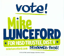
Early in the campaign, I realized that Mike stood out from the other candidates in many ways, but as a designer, I couldn’t help but be impressed by his campaign’s bold graphic design. The two-color design used lime green and a deep blue-green. The eye-catching design also used several very casual fonts and the letters and words were not carefully aligned. They were “wonky,” as my Scottish friend used to say! (wonky=shaky, wrong, awry)

But the design included all the important information—name, position sought, web site, and his slogan “students first!” And it looked to me that the designer gave a slight nod to tradition by adding several stars in the design. No campaign literature is complete without a few stars! But it pushed the limits by using very nontraditional campaign colors.
As I stood at the polling location, wearing my campaign t-shirt and holding my campaign sign, I realized that even with the eye-catching design I needed to do a bit more to attract attention. As I smiled and waved at the people driving by, I was a bit surprised to see that most of them smiled and waved back. So, maybe it wasn’t the lime-green that made the difference after all!


Great website! Great post-election/design-influenced summary article!
I love your soft, but impressionable closure!
Thanks,
Martha Lockett