Return to Sender:
USPS Mailer Fails to Deliver Good Design
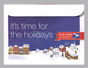
This holiday mailer from the U.S. Postal Service arrived in my mailbox in December. The illustrations and interior design are holiday-inspired and attractive. The mailer folds out to five panels and contains information on mailing and shipping during the holiday season.

However, before I could get to the good stuff inside, I faced the challenge of opening this letter. Although it looks like this is a traditional envelope, it is not. The decision to create a design that is confusing was a poor choice. The item is glued at the top edge, with stretchy clear glue. But for those of us with less-than-perfect vision, this design serves only to frustrate. Our job, as graphic designers, is to make information easily understood and accessible. So, this item, though attractive, fails its first objective…getting the recipient to open it!

When Paper Works Better than Pixels

The paper newsletter remains an effective and popular tool for communicating information. With e-newsletters filling our inboxes, some of us have to do a brutal unsubscribe to reduce the number that reach us. One click makes it easy to subscribe to e-newsletters, but it is much more difficult to find the time to read them all. But we all know that a brief printed newsletter can be read in one “sitting” (and we all know the favorite reading spot in the house!)
The printed newsletter has some advantages over electronic newsletters. Our neighborhood civic club still prints a newsletter six times a year. The homes in our neighborhood were built in the 1960s, and there are still many original owners living here. Many of those folks prefer to receive their neighborhood information in a printed newsletter. But an electronic PDF posted to the club’s website satisfies those who prefer getting their information online. My point is that there are still segments of the population who benefit from receiving printed materials, including newsletters.

Newsletters are often 8-12 pages with brief articles and photos. They are a good vehicle for distributing information to customers, employees, your membership or club. Take a fresh look at your communication efforts and you might find that an old favorite (the printed newsletter) can be a great way to stay in touch.

Face Value

Sephora + Pantone Color IQ Color Matching

Pantone
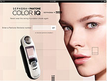
I think most women have had the experience of buying the wrong shade of makeup, and that can result in a less-than-perfect look and wasted money. The shade that looks so good in the bottle at the store can have a frightening effect under the bright lights of the bathroom!

Sephora (cosmetics) and Pantone (color matching systems for the graphic arts) have collaborated to develop a device that takes several images of your skin and compares them to 1,000 shades in Sephora’s Universal Skintone Library. This helps you decide which product will be the best match for your skin tone.

The color match technology was launched at Sephora 5 Times Square on July 26th. You might want to check with your local Sephora to see when it will be available near you.

It’s a great idea for someone like me who is always struggling to decide if I am Creamy Ivory or Light Bisque Porcelain. Science, art, and beauty have combined for some interesting new technology.

Read more about the system on Musings of a Muse beauty blog.

Colorful Clothing Map

Lands’ End Creates Fun Image and Video


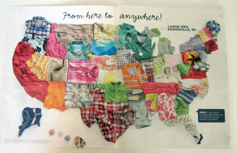
I enjoy a catalog every now and then and this issue of Lands’ End caught my attention, so I thought I’d share. When I took a closer look at the catalog, I noticed a link to the video of how they created this image–fun to watch! It’s a nice touch that they add Wisconsin, their home state, at the end.

Upon closer inspection, I noted some interesting things. Texas is, of course, wearing a country-style plaid shirt. Pennsylvania is much more tropical than I remember from my snowy childhood (palm tree shirt). And, my visits to Kansas were never that much fun. (FUN shirt) Montana looks cozy (tan sweater)…maybe I’ll go there someday. I think the only thing that might make it more interesting would be for the clothing to be seasonal…a bikini for Hawaii and some nice warm scarves for the northern states. But this was a spring break ad, so I can appreciate the bright and vivid choices!

View the short video by clicking this link. Lands’ End Clothing Map

Cutting Edge Design

Caesars Palace® Ad


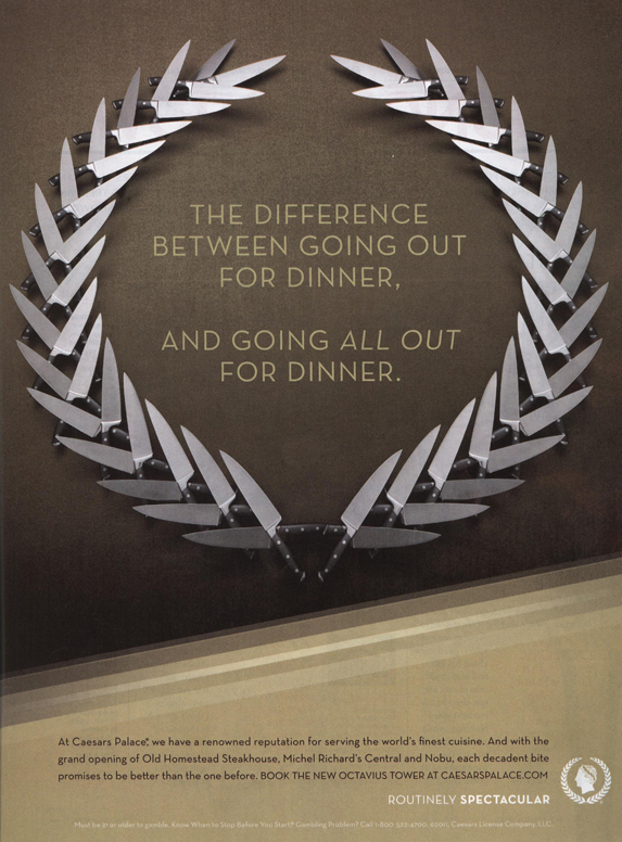
While thumbing though the November issue of Food & Wine, I came across this ad. It caught my eye for several reasons. The magazine is full of attractive photos of fabulous meals and recipe after recipe, but these knives really grabbed my attention.

The simplicity of the ad and the beautiful design impressed me. The precise arrangement of the knives in the shape of the Caesars “laurel wreath” logo was an unexpected surprise. I was interested enough to read the copy to see exactly what was being advertised. In the fine print, the ad announces the opening of several new restaurants at Caesars Palace.

A fine example of great design—Hail Caesars!